Conscious restraint
to elevate perception
Letting the work speak instead of the branding
Jewellery sells on detail — material, finish, the weight of a piece in your hand. Most jewellery brands try to match that with ornament: gold foil, script type, heavy texture. I wanted to test the opposite idea.
I took this project solo, start to finish, for an independent jewellery designer, and built the identity around one question:
What happens if the brand gets quieter instead of louder?

Borrowing from editorial, not from jewellery
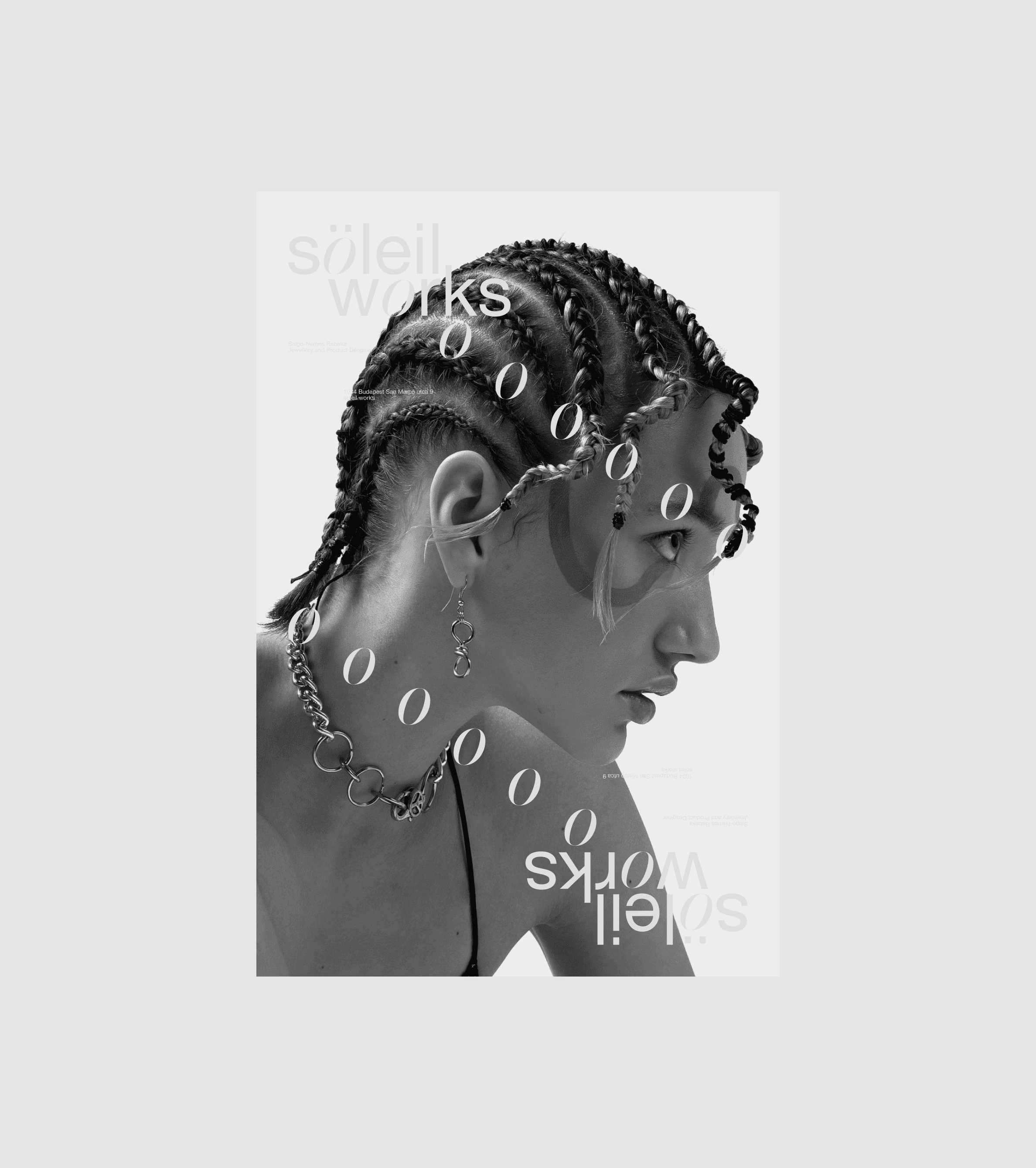
Rather than pull from category convention, I drew the system from editorial design
Swiss-grid discipline, typography doing the expressive work instead of illustration.
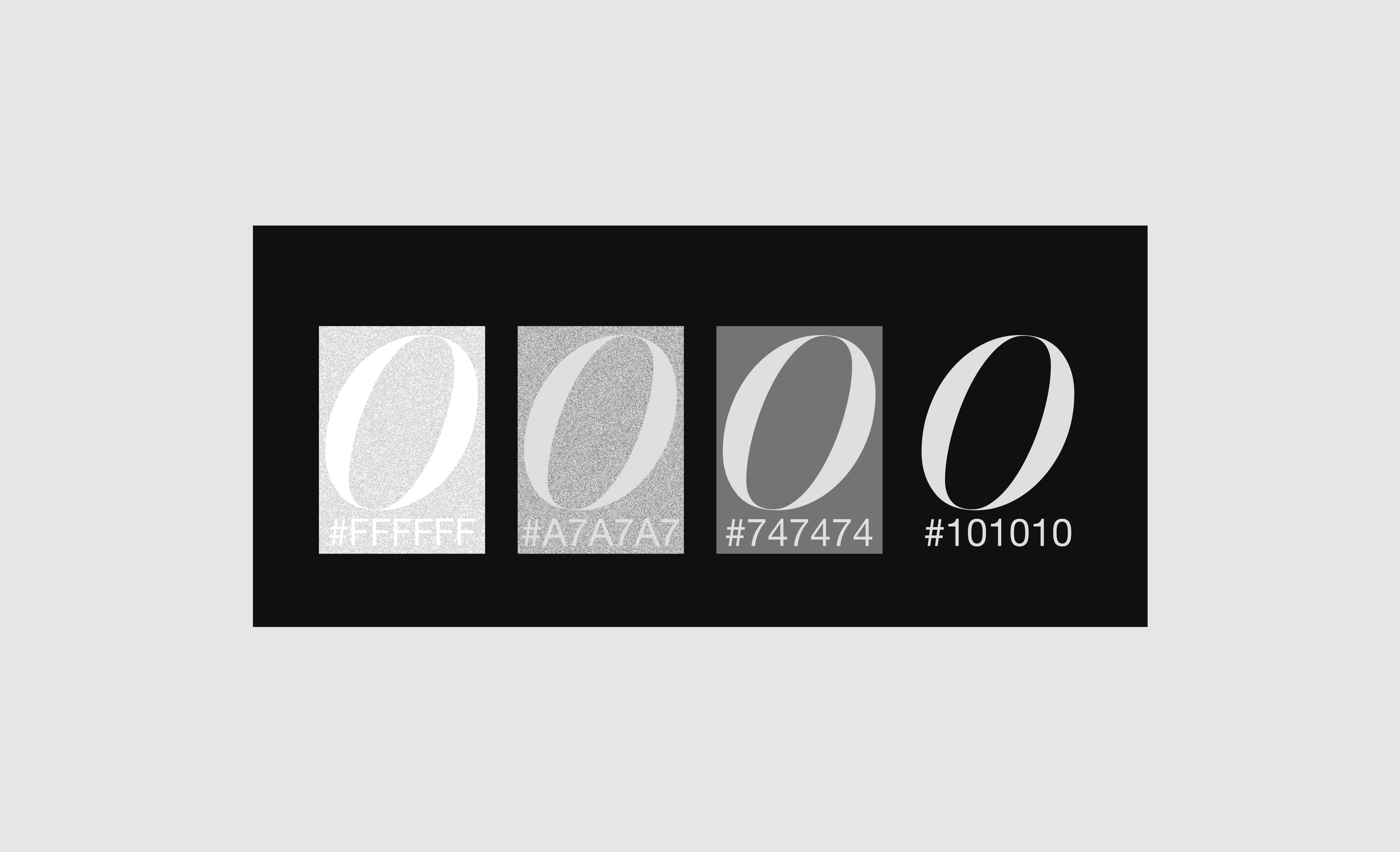
A monochrome palette clears away distraction so the imagery and the product hold attention on their own. Generous whitespace gives every layout room to breathe without going empty.


Generous whitespace gives every layout room to breathe without going empty.

Every choice here is restraint, deliberately — not less design, but design where each remaining element carries more weight because there’s nothing competing with it.
one system, every surface
The deliverable was never just a logo. I built one consistent system that had to hold up across a full set of physical and digital touchpoints:
Every piece follows the same underlying logic, so a business card and a shipping box read as the same brand without either one having to try hard to prove it.



What restraint actually earns
Every choice here is restraint, deliberately — not less design, but design where each remaining element carries more weight because there’s nothing competing with it.


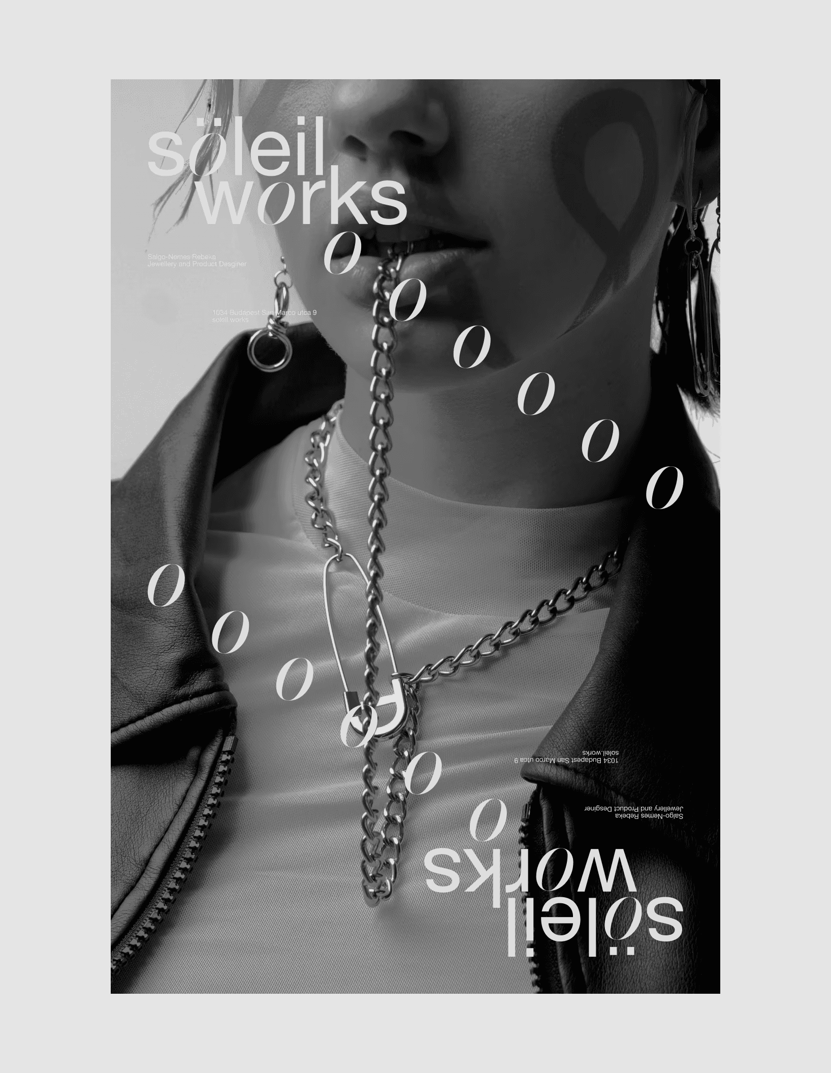
Typography leads,
composition sets the pace, & the jewellery itself stays the focal point throughout,
exactly where it should be.

reflections
The identities people remember aren't the loudest ones — they're the ones that feel inevitable.
Soleil Works was a chance to build that from scratch: editorial thinking and typographic precision doing more with less, where every addition earns its place and every omission makes the rest stronger.
Impact
Owned brand strategy and the complete identity system solo, from concept to final deliverables, in a two-week engagement.
Built a grid-based, typography-led system designed to scale across packaging, stationery, social and documentation.
Delivered a cohesive identity with zero decorative shortcuts — every decision traceable back to a stated design principle.

