Nobody opens this app on a good day
Most products get opened out of curiosity. Marbles gets opened because something already feels wrong — anxiety, a bad night’s sleep, the aftermath of trauma, a feeling someone can’t quite name yet.
I joined as Marbles’ first product designer. In six months, I set the research process, information architecture, and a 300-plus screen system — all with one question in mind: could the product genuinely help someone keep going?
Choosing depth over the usual playbook
Mental health apps mostly reach for the same four things: meditation, breathing exercises, quotes, streaks. They build healthy habits in general, and rarely address a specific condition with any real depth.
I started with a competitor audit.
Then, with our clinical psychologist and researcher, we chose structured, research-backed CBT programmes for specific conditions — postpartum depression, ER and post-trauma recovery, and oncology care — over generic wellbeing content.

Everything downstream traced back to that one decision:
Move beyond generic wellbeing and build depth where people actually need it.
What the research actually said
I didn’t want to guess at what “specific” meant.
Listen
120+ respondents
22-question survey
JTBD + empathy maps
Kano prioritisation

I ran interviews, a 22-question survey across 120+ respondents, empathy maps, and Jobs-to-be-Done sessions to understand how anxiety, insomnia, loneliness, and recovery show up in daily behaviour.
45% had left mental health apps
Because content became repetitive
64% wanted research-backed content
The challenge was never “make more content.” It was making every interaction feel like it was actually for the person using it.
The roadmap prioritised depth in the right places, not a thin layer of everything.

An onboarding that listens before it recommends
The first few minutes decide whether someone trusts the rest of the app.
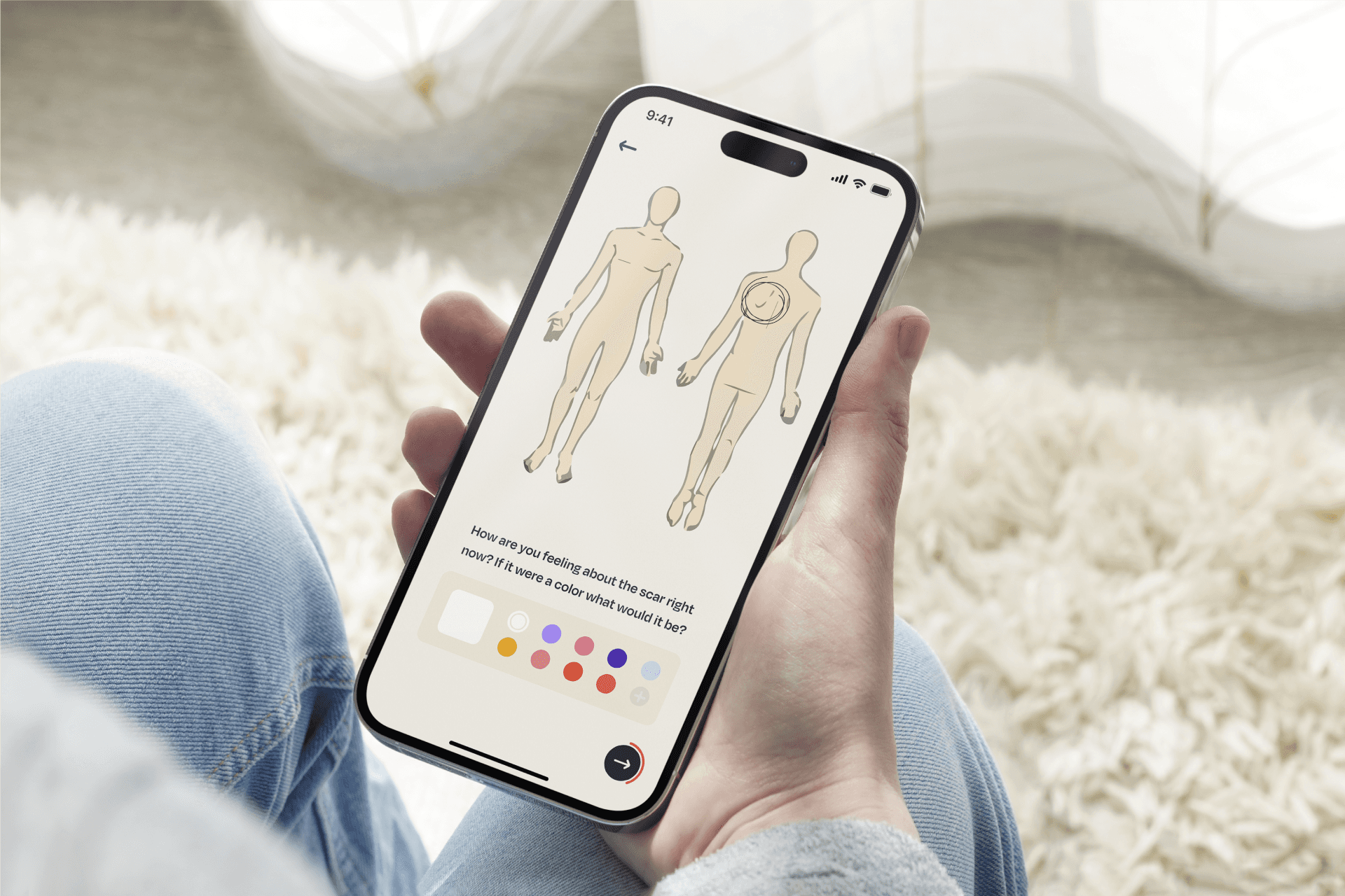
Instead of front-loading assessments or every feature at once, I built onboarding to learn the person gradually — goals, concerns, and preferences — a few questions at a time, so it never feels like a form.
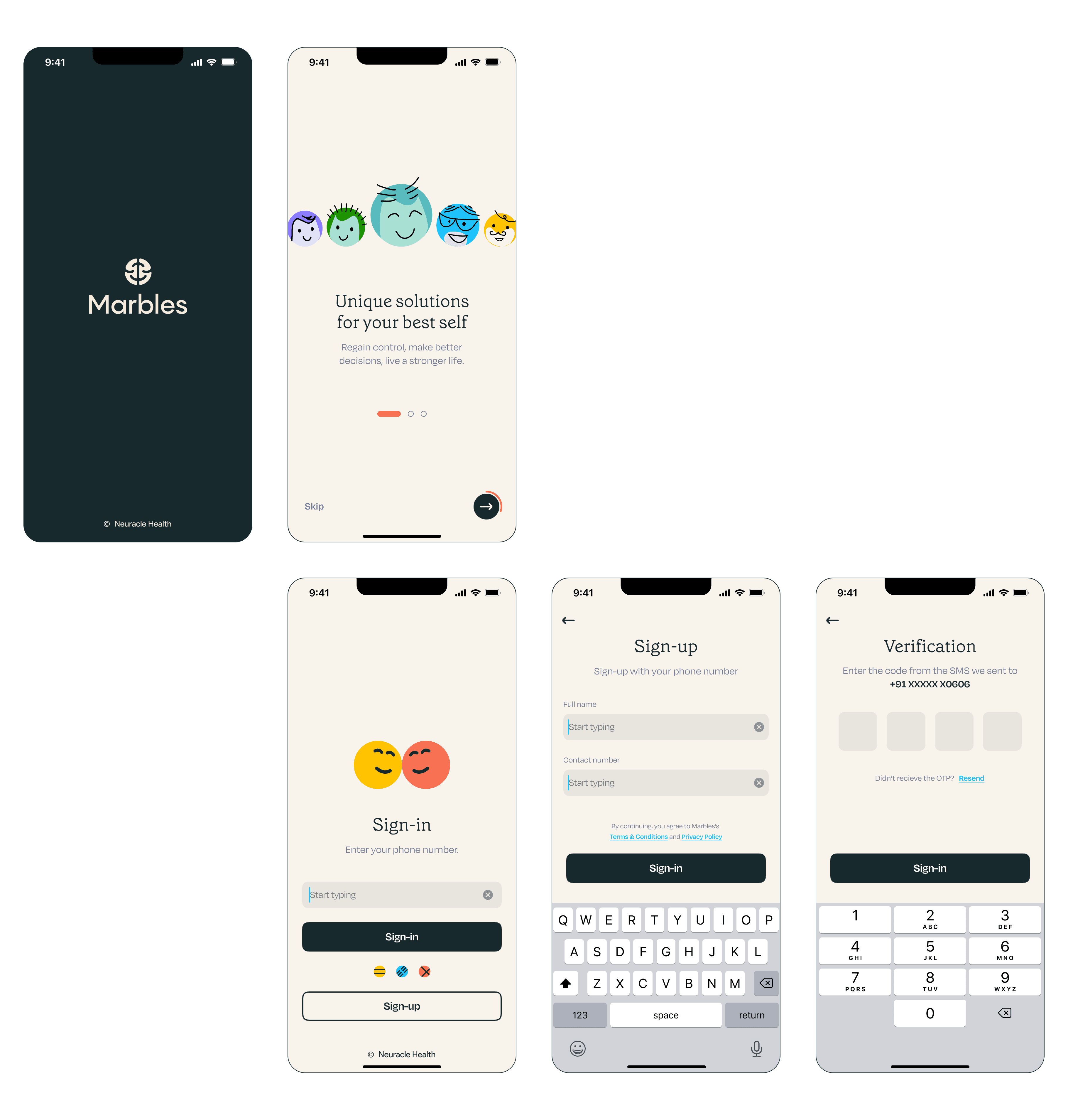
Personalisation shows up only once the product has actually earned enough context to use it well.



The point was not to make onboarding feel shorter. It was to make it feel like someone was listening.


Structure instead of streaks
Recovery doesn’t happen in a single session.
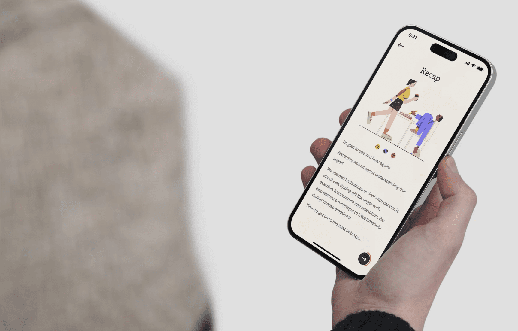
I designed for continuity: daily check-ins, guided CBT programmes, therapist consultations, education, and progress tracking, each one feeding the next.


The product was never trying to solve someone’s mental health in one sitting. It was trying to make tomorrow’s version of showing up slightly easier than today’s.
Restraint as a design decision
Healthcare products often lean on decoration to feel reassuring — bright illustration, cheerful motion, constant encouragement. Sometimes that helps. Often it’s just more noise on top of an already noisy moment.
I went the other way: calm typography, generous spacing, and predictable interaction — so the therapeutic content stays the centre of attention and the interface quietly steps back.


Testing it against real people
50+ testers. Four core scenarios. 88% task success.
The most useful finding wasn’t the number — it was the pattern behind it. People explored everything in the first few days, then narrowed almost entirely to whatever programme they’d already started. That told me where the roadmap needed to double down: continuity, not discovery.
Impact
Set the design foundation — research process, information architecture, and design system — for a research-backed mental healthcare platform as the first designer on the team.
Ran the end-to-end research: competitive audit, 120+ respondent survey, Jobs-to-be-Done, empathy mapping, and Kano — directly shaping the CBT-first product direction.
Designed onboarding, personalisation, and long-term engagement flows, validated through usability testing with 50+ testers and an 88% task success rate.
Built and owned a 300+ screen design system that holds emotional sensitivity and visual consistency at once.

